
SPA Application Using Vue.js, Vuex, Vuetify and Firebase - Part 1
Learn how to create a meal delivery website using Vue.js, Vuex, Vue Router, and Firebase.
Jennifer Bland
Learn how to create a meal delivery website using Vue.js, Vuex, Vue Router, and Firebase. Do you want to learn how to use Vue.js? Want to create a realistic website using Vue.js? In this tutorial, I will teach you how to create a meal delivery website using Vue, Vuex, Vue Router, Vuetify, and Firebase. This tutorial is presented as a series of articles that will take you from installing Vue for the first time to creating a fully functional meal delivery website. The header image above shows the website that we will be creating. This tutorial is broken down into a four-part series. Here are the links to each part of the series: Part 1: Installing Vue and Building an SPA using Vuetify and Vue Router Part 2: Using Vue Router Part 3: Using Vuex and accessing API Part 4: Using Firebase for Authentication This tutorial is suitable for everyone regardless of your skill level. I only assume that you have a knowledge of ES6. Let’s get started.
Installing Vue
Creating a new application using Vue.js is done through their command line interface (CLI). You will need to install the CLI first with this command:
npm install -g @vue/cli
The -g flag tells npm to install the CLI globally. Once it is installed the CLI can be accessed by using the command vue in the terminal. Running this will show the commands available: 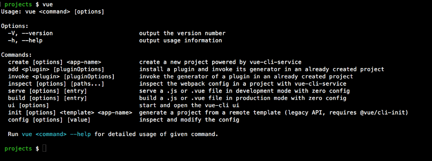
Vue command options. NOTE: If you have read other articles about Vue, you might see them talking about doing an install of the CLI with this command:
npm install -g vue-cli
That installed the old version of the Vue CLI. At the time of the writing of this tutorial, the current version of the Vue CLI is version 3. To install the latest version use the first command that I gave.
Creating Our Meal Prep Application
Now that we have installed the CLI, the next step is to create the scaffolding for our Vue application. From your terminal enter this command:
vue create meal-prep
The Vue CLI will ask a series of questions to determine how to scaffold out your application. At the first prompt, you want to select "Manually select features". 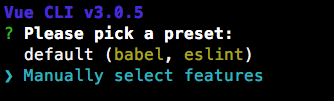
Manually select features when creating Vue application. Next we will be asked to select the features we want to install for our application. For this tutorial select Babel, Router, Vuex and Linter/Formatter. 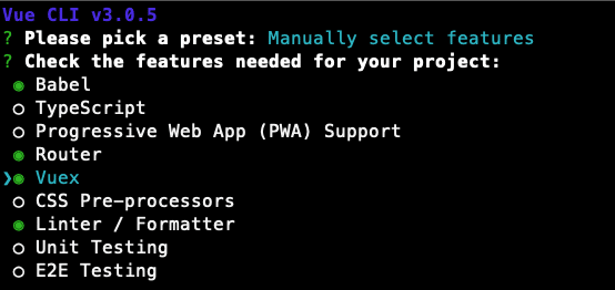
Adding Babel, Router, Vuex and Linter to our application Next, you will be asked a series of questions. For the linter I selected Prettier and selected to Lint on save. I selected the configuration files should be placed in my package.json file instead of in separate configuration files. Here are the options that I selected: 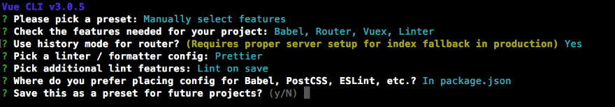
Options selected for Vue application The Vue CLI will scaffold our application using the features that you have selected. Since I told it to create an application named "meal-prep" then it will create a new folder with this name. Once the CLI has successfully created the application, it will give you the command to change into the newly created directory and the command you will need to run to start your application: 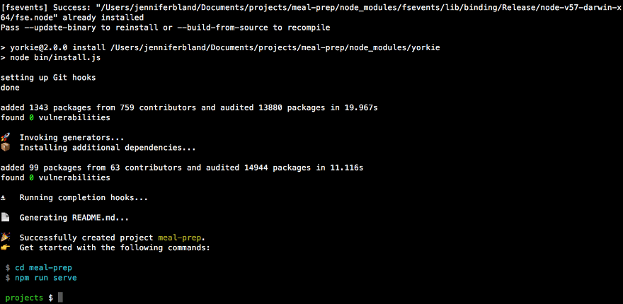
Vue CLI successfully created our application.
Starting our application
To start our application, we will need to cd into the meal-prep directory and run the command npm run serve. Here is what our application looks like: 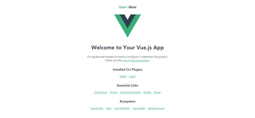
Default Vue application. Vue scaffolded out a SPA application for us and installed Vue Router and Vuex. We can see the Vue Router in action by clicking on About in the menu at the top of the page. This loads the About page. 
About page of our application.
Adding Vuetify
Vuetify is a material design component framework. It is similar to Bootstrap. Vuetify provides 80+ material design components that we can use to style our SPA in Vue. To add Vuetify to our application, first, go to your terminal and stop the server. Then add Vuetify to our application with this command:
vue add vuetify
You will be asked a series of questions. I am going to choose not to use the pre-made template because I want to keep the structure created by the default Vue application. For the rest of the questions, I took the default. Here are my answers to the questions: 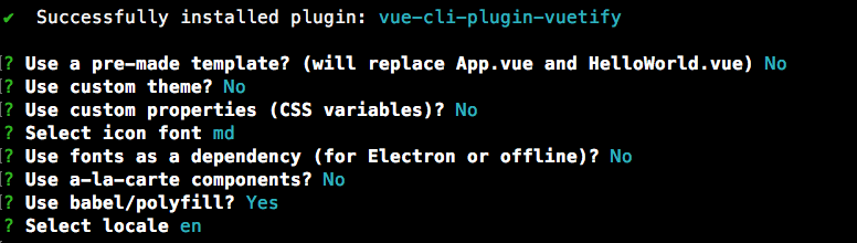
Options selected when installing Vuetify.
Configuring Prettier
During the creation of our Vue application, I selected to use Prettier for linting. I also selected to have the configuration setting installed in the package.json file. I want to take time now to configure Prettier to use my preferred settings. In your code editor, open the package.json file. In this file, you will see the default settings that have been created for eslint. Right after the eslintConfig object and before the postcss object, I am going to add settings to configure Prettier. I am going to set the indent to 4 spaces and to use single quotes. (Notes: if you prefer an indent of 2 spaces and/or to use double quotes then you do not need to add this change.) Here is the Prettier setting that I have added to my package.json file: 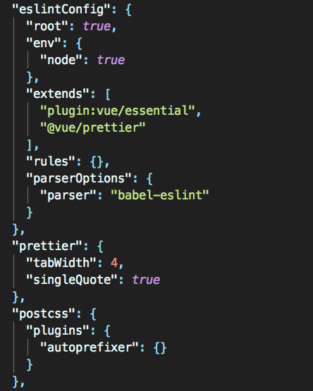
Prettier configuration in package.json file. Next I want to reconfigure all the files to use my new Prettier settings. That means changing all indents from 2 spaces to 4 spaces and to change double quotes to single quotes. Luckily Vue provides a lint script that will fix all these issues for me automatically. From the terminal run this command:
npm run lint
This will lint all the files and change them to my new Prettier settings. This command will give you a list of all the files that have been auto-fixed. 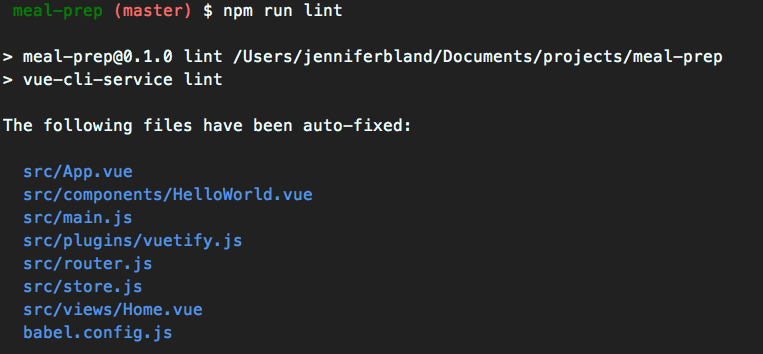
Lint auto-fixed all the files for us.
Styling The Home Page of Our Application
We will be using Vuetify to style our application. You can find more details about all the UI Components that Vuetify offers here. All application using Vuetify have to be wrapped with . Open up the App.vue file and delete all the code in the template and all the styles. Your App.vue should look like this:
<template>
    <v-app>
        <v-content transition="slide-x-transition">
            <router-view></router-view>
        </v-content>
    </v-app>
</template>

<script>
export default {
    name: 'App'
};
</script>

<style>
</style>
This code wraps our application in the
Creating the Home Page
Next open the Home.vue file located in the views folder. We are going to get rid of the code that is there. Remove all the content in the template. Remove the import command for HelloWorld and the comment. Remove the components object. Here is what we will be creating for the home page: 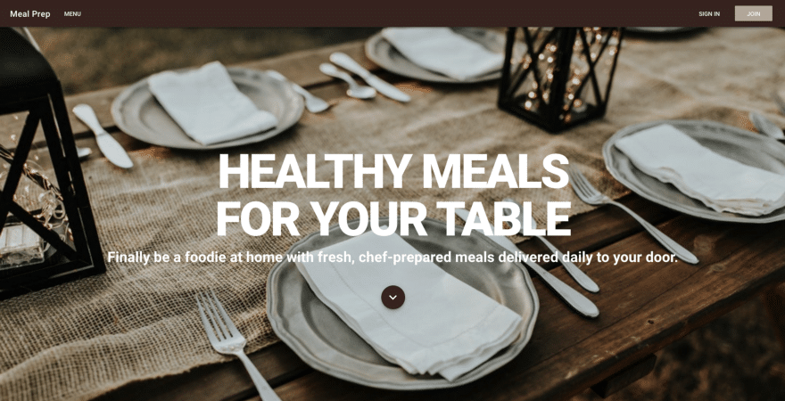
The home page for the Meal Prep Application
App Navigation
The first thing we are going to start with is the navigation. I am going to create a new Vue component just for the navigation. In the components folder create a new file called AppNavigation.vue. Our navigation will have to work on many different screen sizes. On bigger screens like a laptop or desktop, we will display a menu across the top of the screen. On smaller devices like a mobile phone, we will display the traditional hamburger menu icon. When a user click on the icon a drawer will slide in from the left with our menu. This drawer will remain on top of the website until the user closes it. Vuetify provides two tools to display the menu for different screen sizes. For medium and large screens we will be using the Vuetify
<template>

</template>

<script>
export default {
    name: 'AppNavigation'
};
</script>

<style scoped>
</style>
We will start with creating the menu that will be displayed on medium and large screen sizes. To do that we will use the
<template>
        <v-toolbar app color="brown darken-4" dark>
            <v-toolbar-side-icon></v-toolbar-side-icon>
            <v-toolbar-title>{{appTitle}}</v-toolbar-title>
            <v-btn flat>Menu</v-btn>
            <v-spacer></v-spacer>
            <v-btn flat>SIGN IN</v-btn>
            <v-btn color="brown lighten-3">JOIN</v-btn>
        </v-toolbar>
</template>

<script>
export default {
    name: 'AppNavigation'
};
</script>

<style scoped>
</style>
This code will produce this menu: 
Menu toolbar Let me explain the items that I have used in the menu. For the
Improving the Styling in the Navigation
The first implementation of the navigation provides all the features that I would like for it to have. But I would like to make some changes. First, I don't want the hamburger menu to be shown unless I am on a small device. Likewise I don't want any button in the menu to be shown when I am on a small device. Vuetify provides a display helper. The display helpers allow you to control the display of content. This includes being conditionally visible based upon the current viewport, or the actual element display type. For the toolbar side icon I want it to only be visible on XS and SM devices. For MD and LG screens I want the toolbar side icon to not be visible. Likewise I want all the buttons to be shown on MD and LG screens and hidden on smaller screens. I will add the class hidden-md-and-up on the toolbar side icon. I will add the class hidden-sm-and-down to all buttons and the spacer. Now I am going to be a stickler here because I want to add one more layout change. When displaying the app on small devices I will only see the hamburger menu and the app title. Currently they are both on the left side of the screen. I want to change this so that the app title appears on the right side of the screen. This will provide a balance between the two items that are displayed. To do this I am going to add a new
<v-toolbar app color="brown darken-4" dark>
    <v-toolbar-side-icon class="hidden-md-and-up" @click="drawer = !drawer"></v-toolbar-side-icon>
    <v-spacer class="hidden-md-and-up"></v-spacer>
    <v-toolbar-title>{{appTitle}}</v-toolbar-title>
    <v-btn flat class="hidden-sm-and-down">Menu</v-btn>
    <v-spacer class="hidden-sm-and-down"></v-spacer>
    <v-btn flat class="hidden-sm-and-down">SIGN IN</v-btn>
    <v-btn color="brown lighten-3" class="hidden-sm-and-down">JOIN</v-btn>
</v-toolbar>
If you want to see how it looks when you resize the screen, here is the first giphy I have ever created. :-) 
Creating the Navigation for small screens
For small screens we will use Vuetify's
<template>
    <span>
        <v-navigation-drawer app v-model="drawer" class="brown lighten-2" dark disable-resize-watcher>
            <v-list>
                <template v-for="(item, index) in items">
                    <v-list-tile :key="index">
                        <v-list-tile-content>
                            {{item.title}}
                        </v-list-tile-content>
                    </v-list-tile>
                    <v-divider :key="`divider-${index}`"></v-divider>
                </template>
            </v-list>
        </v-navigation-drawer>
        <v-toolbar app color="brown darken-4" dark>
            <v-toolbar-side-icon class="hidden-md-and-up" @click="drawer = !drawer"></v-toolbar-side-icon>
            <v-spacer class="hidden-md-and-up"></v-spacer>
            <v-toolbar-title>{{appTitle}}</v-toolbar-title>
            <v-btn flat class="hidden-sm-and-down">Menu</v-btn>
            <v-spacer class="hidden-sm-and-down"></v-spacer>
            <v-btn flat class="hidden-sm-and-down">SIGN IN</v-btn>
            <v-btn color="brown lighten-3" class="hidden-sm-and-down">JOIN</v-btn>
        </v-toolbar>
    </span>
</template>

<script>
export default {
    name: 'AppNavigation',
    data() {
        return {
            appTitle: 'Meal Prep',
            drawer: false,
            items: [
                { title: 'Menu' },
                { title: 'Sign In' },
                { title: 'Join' }
            ]
        };
    }
};
</script>

<style scoped>
</style>
Let me explain what I have put in for the drawer navigation. I have added the prop app. This is the same prop we added for toolbar. Next I have added a v-model that is looking for the data item called drawer. In data the drawer will be initially set to false. This means the drawer is closed. The drawer will open when it is true and close when it is false. I have added a click method on the toolbar side icon. When you click on the hamburger menu it will change the value of drawer from true to false or vice versa. The last item I have added is to give it a class with a color of brown lighten-2. I decided to add a color to my drawer since the default color is white. Next I am using Vuetify's
export default {
    name: 'AppNavigation',
    data() {
        return {
            appTitle: 'Meal Prep',
            drawer: false,
            items: [
                { title: 'Menu' },
                { title: 'Sign In' },
                { title: 'Join' }
            ]
        };
    }
};
When we click on the hamburger menu this is what the drawer will look like: 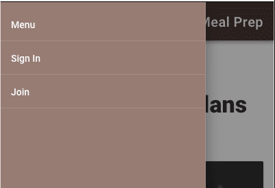
Drawer navigation for small devices
Adding Navigation to the Application
Now that we have created our AppNavigation component we need to add it to our application. Open up the App.vue file. Inside that file we will need to import our AppNavigation component. Then we can place it in our application. Here is the code you should have in your App.vue file:
 <template>
    <v-app>
        <app-navigation></app-navigation>

        <v-content transition="slide-x-transition">
            <router-view></router-view>
        </v-content>
    </v-app>
</template>

<script>
import AppNavigation from '@/components/AppNavigation';

export default {
    name: 'App',
    components: {
        AppNavigation
    }
};
</script>

<style>
</style>
First you need to import the AppNavigation. When I import it I give it a name of AppNavigation. In the script I have added a components object that contains AppNavigation. The format of the name is important. When the component is added it will hyphenate the name. When I put the component in the html template I use the hyphenated name of
Creating the content for our Home Page
We are going to add a full-screen image for our home page. Then we are going to add text over the image. Instead of putting our code directly in the Home.vue file located in the views folder, I am going to create a new Vue component. In the components folder create a new file called HomeHero.vue. Vuetify has a 12 point grid system. Built using flex-box, the grid is used to layout an application's content.The v-container can be used for a center focused page, or given the fluid prop to extend its full width. v-layout is used for separating sections. The structure of your layout will be as follows, v-container » v-layout » v-flex. We will use this grid system in the design for our HomeHero component. We are going to use
class="display-4 font-weight-black white--text"
The display-4 will produce text that has a font size of 112sp and a font weight of light. I am going to override that font-weight by specifying a font-weight-black. I want the text to be white so I can add white--text The last thing I add is to specify the text to be centered. I will use the same styling for the second row of text. The only addition is I add an alignment of mb-3. Vuetify provides 5 levels of spacing. The mb is saying apply a margin-bottom of 3. This will provide some spacing between the header and subHeader text. The last thing I add is a button toward the bottom of the screen. I add this because sometimes people might not think to scroll down to see more content since the image is fullscreen. The image is a visual indicator to the users that there is more content below. I am using the
<template>
    <v-container fluid fill-height class="home-hero">
        <v-layout justify-center align-center column pa-5>
            <div class="display-4 font-weight-black white--text text-xs-center">HEALTHY MEALS</div>
            <div class="display-4 font-weight-black white--text text-xs-center mb-3">FOR YOUR TABLE</div>
            <div class="display-1 font-weight-bold white--text text-xs-center">Finally be a foodie at home with fresh, chef-prepared meals delivered daily to your door.</div>
            <v-btn fab class="mt-5 brown darken-4">
            <v-icon large color="white">expand_more</v-icon>
            </v-btn>
        </v-layout>
    </v-container>
</template>

<script>
export default {
    name: 'HomeHero'
};
</script>

<style scoped>
.home-hero {
    background: url('http://source.unsplash.com/0BhSKStVtdM');
    background-size: cover;
    width: 100%;
    height: 100%;
}
</style>
Adding HomeHero Component to Application
Now that we have created our component we need to add it to the application. Open up the Home.vue file in the views folder. Just like we did with AppNavigation, you will need to import the component and place it in the template. Here is what the Home.vue file should look like:
<template>
    <span>
        <home-hero></home-hero>
    </span>
</template>

<script>
import HomeHero from '@/components/HomeHero';

export default {
    name: 'home',
    components: {
        HomeHero
    }
};
</script>
Adding More Content to Home Page
Right now we have a very nice looking home page. But we need to add more content to explain what our meal prep service provides to potential customers. So let's add that now. For the content we will create a new component called HomeDetails.vue. In the components folder create a new file called HomeDetails.vue. For the content I am going to use Lorem Ipsum for the text. I will use the Vuetify layout scheme by creating the root element with the
<template>
    <v-container>
        <v-layout column>
            <v-flex  class="display-2 text-xs-center my-5">Big Title Goes Here</v-flex>
            <v-flex>
                <div class="headline mt-3">Lorem ipsum</div>
                <p class="subheading mt-3">Lorem ipsum dolor sit amet, consectetur adipiscing elit. Cras pulvinar risus quis mauris interdum, in euismod nibh pretium. Etiam pulvinar tincidunt dapibus. Quisque sollicitudin, mauris a consequat consectetur, turpis nisl sollicitudin enim, id consectetur neque neque nec metus. Pellentesque dolor nisi, vulputate quis lobortis ac, tincidunt et quam. Mauris pulvinar blandit nisi nec mattis. Aliquam accumsan ut sem eget efficitur. Vivamus in tortor gravida eros laoreet condimentum nec vel dui. Nullam quam massa, ultrices eget tincidunt a, pulvinar ac libero.</p>
            </v-flex>
            <v-flex>
                <div class="headline mt-3">Lorem ipsum</div>
                <p class="subheading mt-3">Lorem ipsum dolor sit amet, consectetur adipiscing elit. Cras pulvinar risus quis mauris interdum, in euismod nibh pretium. Etiam pulvinar tincidunt dapibus. Quisque sollicitudin, mauris a consequat consectetur, turpis nisl sollicitudin enim, id consectetur neque neque nec metus. Pellentesque dolor nisi, vulputate quis lobortis ac, tincidunt et quam. Mauris pulvinar blandit nisi nec mattis. Aliquam accumsan ut sem eget efficitur. Vivamus in tortor gravida eros laoreet condimentum nec vel dui. Nullam quam massa, ultrices eget tincidunt a, pulvinar ac libero.</p>

                <p class="subheading mt-3">Nullam nec massa eu est fringilla lobortis. Praesent in enim in justo blandit varius. Cras placerat arcu in sapien rhoncus aliquet. Sed interdum tortor et tincidunt condimentum. Etiam consequat mi leo, in suscipit odio scelerisque molestie. Nam et purus consequat, iaculis augue vel, sagittis ligula. Vestibulum aliquet vulputate erat. Phasellus id mauris mauris. Nunc a maximus dolor. Curabitur ut vestibulum arcu. Curabitur non lacus justo. Cras varius a magna in semper. Nulla eros ante, consectetur faucibus sapien eu, rhoncus imperdiet dui. Sed viverra iaculis nunc, id pulvinar massa egestas vitae.</p>

                <p class="subheading mt-3">Aenean erat metus, imperdiet eget nisl laoreet, venenatis ultricies ante. In interdum ante vel dictum ullamcorper. Pellentesque habitant morbi tristique senectus et netus et malesuada fames ac turpis egestas. Integer sit amet gravida diam. Aliquam in tempor metus. Fusce pellentesque pharetra sem, et luctus justo tempor dictum. Ut feugiat est sed tristique egestas. Nullam posuere a nunc in blandit. Vestibulum ante ipsum primis in faucibus orci luctus et ultrices posuere cubilia Curae; Suspendisse laoreet ultrices eros, nec malesuada enim semper sit amet. Maecenas efficitur consectetur accumsan. Etiam in aliquam turpis, ut pharetra nulla. Vestibulum malesuada, nulla id elementum cursus, nibh dui rhoncus felis, suscipit mattis felis enim sed ex. Pellentesque scelerisque aliquam lorem, vel mattis nibh tincidunt ac. Suspendisse ac nibh sit amet lacus ullamcorper maximus.</p>
            </v-flex>
            <v-flex>
                <div class="headline mt-3">Lorem ipsum</div>
                <p class="subheading mt-3">Nullam nec massa eu est fringilla lobortis. Praesent in enim in justo blandit varius. Cras placerat arcu in sapien rhoncus aliquet. Sed interdum tortor et tincidunt condimentum. Etiam consequat mi leo, in suscipit odio scelerisque molestie. Nam et purus consequat, iaculis augue vel, sagittis ligula. Vestibulum aliquet vulputate erat. Phasellus id mauris mauris. Nunc a maximus dolor. Curabitur ut vestibulum arcu. Curabitur non lacus justo. Cras varius a magna in semper. Nulla eros ante, consectetur faucibus sapien eu, rhoncus imperdiet dui. Sed viverra iaculis nunc, id pulvinar massa egestas vitae.</p>
            </v-flex>
        </v-layout>
    </v-container>
</template>

<script>
export default {
    name: 'HomeDetails'
};
</script>

<style scoped>
</style>
Adding HomeDetails to The Application
We will add HomeDetails to the application just like we did for HomeHero. Open up the Home.vue file in the views folder. You will need to import HomeDetails component. Then add it to the template below HomeHero. Here is what the Home.vue file looks like:
<template>
    <span>
        <home-hero></home-hero>
        <home-details></home-details>
    </span>
</template>

<script>
import HomeHero from '@/components/HomeHero';
import HomeDetails from '@/components/HomeDetails';

export default {
    name: 'home',
    components: {
        HomeHero,
        HomeDetails
    }
};
</script>
When we add this new component, it causes a problem with our layout. Now the text is centered based on the total height of the image as well as the new text content. Here is what it looks like: 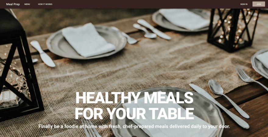
Problems with our layout. We can easily correct this problem by specifying a max-height for the container that has our image. We want this container to be 100% of the height of our viewport. Open up the HomeHero.vue file. On the
<v-container fluid fill-height class="home-hero" style="max-height: 100vh;">
Now we are back to having a fullscreen image with our text centered on the image. We can then scroll down to see the details.
Creating Meal Plans Component
After the details I want to add images of the meal plans that we are offering on our meal prep website. For my meal prep website, I will be offering Keto, Paleo and Vegan meal plans. Feel free to customize your application to offer the meal plans you would like to offer to customers. Let's create a new component. In the components folder create a new file called HomePlans.vue. We will use the Vuetify grid layout. Our root element will be a
<template>
    <v-container grid-list-lg>
        <v-layout row>
            <v-flex xs12 class="text-xs-center display-1 font-weight-black my-5">Available Meal Plans</v-flex>
        </v-layout>
        <v-layout row wrap>
            <v-flex xs12 sm12 md4>
                <v-card>
                    <v-img src="http://source.unsplash.com/hjCA3ecCXAQ" height="500px">
                        <v-container fill-height fluid>
                            <v-layout fill-height>
                                <v-flex xs12 align-end flexbox>
                                    <span class="headline white--text">KETO</span>
                                </v-flex>
                            </v-layout>
                        </v-container>
                    </v-img>

                    <v-card-title primary-title>
                        <div>
                            <h3 class="headline mb-0">Keto</h3>
                            <div>Lorem ipsum dolor sit amet, consectetur adipiscing elit. Nullam mauris felis, varius rutrum massa a, dignissim ornare dui. Cras eget velit eu dui tristique lobortis sit amet vel tellus.
                            </div>
                        </div>
                    </v-card-title>
                </v-card>
            </v-flex>

            <v-flex xs12 sm12 md4>
                <v-card>
                    <v-img src="http://source.unsplash.com/6S27S6pZ6o0" height="500px">
                        <v-container fill-height fluid>
                            <v-layout fill-height>
                                <v-flex xs12 align-end flexbox>
                                    <span class="headline white--text">PALEO</span>
                                </v-flex>
                            </v-layout>
                        </v-container>
                    </v-img>
                    <v-card-title primary-title>
                        <div>
                            <h3 class="headline mb-0">Paleo</h3>
                            <div>Lorem ipsum dolor sit amet, consectetur adipiscing elit. Nullam mauris felis, varius rutrum massa a, dignissim ornare dui. Cras eget velit eu dui tristique lobortis sit amet vel tellus.
                            </div>
                        </div>
                    </v-card-title>
                </v-card>
            </v-flex>

            <v-flex xs12 sm12 md4>
                <v-card>
                    <v-img src="http://source.unsplash.com/1SPu0KT-Ejg" height="500px">
                        <v-container fill-height fluid>
                            <v-layout fill-height>
                                <v-flex xs12 align-end flexbox>
                                    <span class="headline white--text">VEGAN</span>
                                </v-flex>
                            </v-layout>
                        </v-container>
                    </v-img>
                    <v-card-title primary-title>
                        <div>
                            <h3 class="headline mb-0">Vegan</h3>
                            <div>Lorem ipsum dolor sit amet, consectetur adipiscing elit. Nullam mauris felis, varius rutrum massa a, dignissim ornare dui. Cras eget velit eu dui tristique lobortis sit amet vel tellus.
                            </div>
                        </div>
                    </v-card-title>
                </v-card>
            </v-flex>
        </v-layout>
    </v-container>
</template>

<script>
export default {
    name: 'HomePlans'
};
</script>

<style scoped>
</style>
Adding HomePlans to the Application
We have done this already several times before. Open up the Home.vue file in the views folder. Import the HomePlans.vue component and place it in the template below HomeDetails. This is the code for Home.vue:
<template>
    <span>
        <home-hero></home-hero>
        <home-details></home-details>
        <home-plans></home-plans>
    </span>
</template>

<script>
import HomeHero from '@/components/HomeHero';
import HomeDetails from '@/components/HomeDetails';
import HomePlans from '@/components/HomePlans';

export default {
    name: 'home',
    components: {
        HomeHero,
        HomeDetails,
        HomePlans
    }
};
</script>
This is what the meal plans section looks like: 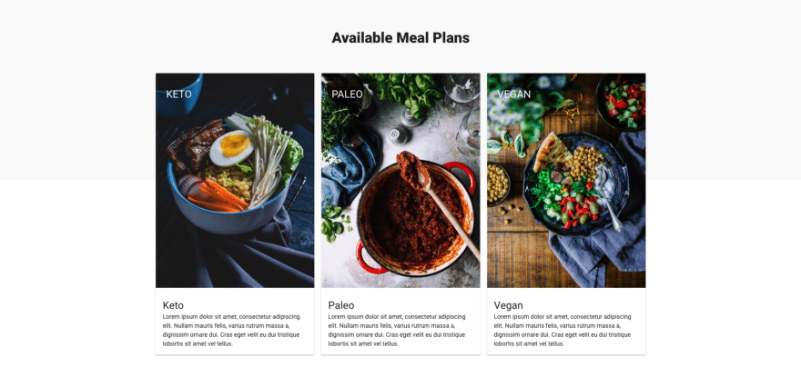
Available meal plans.
Get the Code
Even though this is a 4-part series, you can get the finished code in my GitHub account. Please help me out and star the repo when you get the code.
Summary
In the first part of this series, you have learned:
- how to install Vue
- how to add Vuetify to an application
- how to create multiple components
- how to style components using Vuetify
What's Next
In the next part of this series, we will cover Vue Router. Vue Router allows you to navigate between different pages in your application. For example, we show a list of menus that are available. When a user clicks on one they should be shown the details for that menu. Vue Router is what we will use to transition from the list of recipes page to the details page. See you in the next lesson.