
How to Build a Custom Theme in Nuxt UI v4
Learn how to create a custom theme in Nuxt UI v4 using design tokens, Tailwind CSS, custom colors, fonts, and dark mode.
Jennifer Bland
How to Build a Custom Theme in Nuxt UI v4
Every great app has its own visual identity. The default Nuxt UI look is polished and clean. Out of the box, every Nuxt UI app shares the same polished, default look. Whether you're building a SaaS product, a personal blog, or a client project, you'll eventually need to make it yours.
The good news? Theming in Nuxt UI v4 is one of its best features. With just a CSS file and a config file, you can transform the look of your entire application to match any brand.
Nuxt UI's theming system is built around CSS variables and design tokens, with Tailwind CSS and the @theme directive at the center. No forking. No hacks. No overrides. Just clean, token-based theming that scales.
That gives you a few nice benefits:
- your theme lives in one obvious place
- colors and fonts are easier to reuse
- light and dark mode become much easier to manage
- you can brand the whole app without rewriting each component one by one
In this guide, we'll build a custom theme from scratch. We will utilize fonts we like, implement our brand's colors, and override component-level defaults. By the end, you'll have a fully branded design system and a clear mental model for extending it further.
What You'll Need
Before diving in, make sure you have:
- A Nuxt project with
@nuxt/uiv4 installed - Basic familiarity with Tailwind CSS utility classes
- Node.js 18 or higher
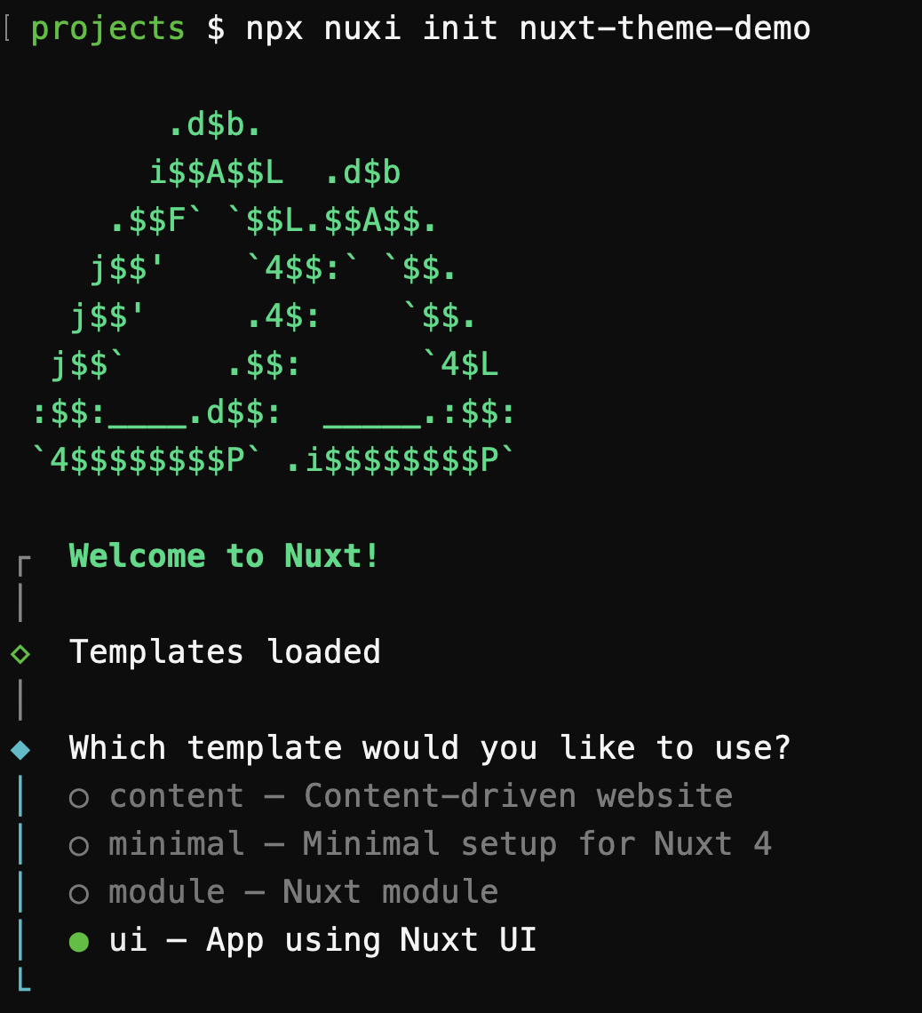
If you're starting from scratch, scaffold a new project to include Nuxt UI. When you run the following command, you will be prompted to choose a template. Select the "ui - App using Nuxt UI" template.
npx nuxi init nuxt-theme-demo
How Theming Works in Nuxt UI v4
It helps to understand the architecture before touching any files. Nuxt UI v4 theming is built on three layers, each with a distinct responsibility:
Layer 1 — main.css (Design Tokens)
This is where you define your raw design values — fonts, colors, spacing — using Tailwind CSS v4's @theme directive. Think of this as your brand's DNA.
Layer 2 — app.config.ts (Semantic Mapping)
This is where you map your raw tokens to semantic meaning — telling Nuxt UI which color is primary, which is neutral, and so on. This layer is also reactive at runtime, meaning you can swap themes without a redeploy.
Layer 3 — app.config.ts Component Overrides (Component Styling)
Also in app.config.ts, you can override the styles of individual components globally — changing the default button size, making all cards have rounded corners, or making the navigation link text bold.
Let's build each layer.
Step 1: Set Up Your CSS File
NOTE: If you created your project using the "ui" template, this file will already exist. If you are adding Nuxt UI to an existing project, you will need to create this file.
Open (or create) your assets/css/main.css file. This is Nuxt UI's main entry point for global styles and the place where Tailwind v4 configuration lives.
Start with the required imports:
/* assets/css/main.css */
@import "tailwindcss";
@import "@nuxt/ui";
Make sure this file is referenced in your nuxt.config.ts:
// nuxt.config.ts
export default defineNuxtConfig({
  css: ['~/assets/css/main.css'],
  modules: ['@nuxt/ui'],
})
Step 2: Customize Your Fonts
The first thing visitors notice about a brand is often its typography. Nuxt UI v4 integrates with @nuxt/fonts, which means any font you declare in your CSS is automatically loaded and optimized — no manual <link> tags, no Google Fonts boilerplate.
Add your fonts inside a @theme block:
/* assets/css/main.css */
@import "tailwindcss";
@import "@nuxt/ui";

@theme {
  --font-sans: 'Inter', system-ui, sans-serif;
  --font-mono: 'JetBrains Mono', monospace;
}
The --font-sans variable controls body text across your entire app. The --font-mono variable handles code blocks and any element using the font-mono utility. Tailwind will instantly expose utilities like font-sans and font-mono for you to use in your templates.
Tip: Choose a sans-serif that matches your brand's personality. Geometric fonts like Inter or DM Sans feel modern and technical. Humanist fonts like Nunito or Lato feel approachable and friendly.
Step 3: Define Your Brand Colors
This is where the fun begins. Nuxt UI uses a semantic color system — you define raw color palettes in CSS, then map them to semantic roles (primary, secondary, etc.) in your config.
3a. Register Your Custom Color Palette
Inside a @theme static block, define your brand color as a full scale from 50 to 950. You need all shades because Nuxt UI components use them for hover states, focus rings, backgrounds, and text.
If you created your project using the "ui" template, this block will already exist as it customizes the color green to match Nuxt's brand color. If you are adding Nuxt UI to an existing project, you will need to create this block.
Here is what the block looks like in the template:
/* assets/css/main.css */
@import "tailwindcss";
@import "@nuxt/ui";

@theme static {
  --font-sans: 'Public Sans', sans-serif;

  --color-green-50: #EFFDF5;
  --color-green-100: #D9FBE8;
  --color-green-200: #B3F5D1;
  --color-green-300: #75EDAE;
  --color-green-400: #00DC82;
  --color-green-500: #00C16A;
  --color-green-600: #00A155;
  --color-green-700: #007F45;
  --color-green-800: #016538;
  --color-green-900: #0A5331;
  --color-green-950: #052E16;
}
If you use set your primary color to green then it uses the Nuxt green color palette.
To customize your brand colors, you can add your own custom color palette. Here's an example using a custom blue-ish "brand" color:
/* assets/css/main.css */
@import "tailwindcss";
@import "@nuxt/ui";

@theme {
  --font-sans: 'Inter', system-ui, sans-serif;
}

@theme static {
  --color-brand-50:  #eff6ff;
  --color-brand-100: #dbeafe;
  --color-brand-200: #bfdbfe;
  --color-brand-300: #93c5fd;
  --color-brand-400: #60a5fa;
  --color-brand-500: #3b82f6;
  --color-brand-600: #2563eb;
  --color-brand-700: #1d4ed8;
  --color-brand-800: #1e40af;
  --color-brand-900: #1e3a8a;
  --color-brand-950: #172554;
}
Why
@theme static? Thestaticmodifier tells Tailwind to resolve these variables at build time, which gives better performance than dynamic resolution. Use@theme staticfor color palettes that won't change at runtime.
Once defined, Tailwind immediately exposes utilities like bg-brand-500, text-brand-700, and border-brand-200 across your entire project.
Tip: Not sure what color values to use? Tools like Tailwind's color palette or uicolors.app can generate a full 50–950 scale from a single hex value.
3b. Map Colors to Semantic Roles
Now open your app.config.ts and tell Nuxt UI what each semantic role maps to:
// app.config.ts
export default defineAppConfig({
  ui: {
    colors: {
      primary: 'brand',     // Your main brand color
      secondary: 'purple',  // Accent / secondary actions
      success: 'green',
      info: 'blue',
      warning: 'amber',
      error: 'red',
      neutral: 'zinc',      // Grays, backgrounds, borders
    }
  }
})
That's it. Every Nuxt UI component that accepts a color prop will now use your brand color when color="primary" is set:
<template>
  <!-- These all use your brand color automatically -->
  <UButton color="primary">Save Changes</UButton>
  <UAlert color="warning" title="Heads up!" />
  <UBadge color="success">Active</UBadge>
</template>
You can also use semantic color utilities directly in your templates:
<template>
  <div class="bg-primary text-white">Primary background</div>
  <span class="text-success">All good!</span>
  <p class="text-error">Something went wrong.</p>
</template>
Step 3c: Add Your Brand Colors to Semantic Roles
Most Nuxt UI components accept a color prop. This prop can be set to a semantic color role. The default semantic color roles are:
- primary
- secondary
- success
- info
- warning
- error
- neutral
You can add your own custom semantic color roles by adding them to the ui.colors object in your app.config.ts file and your nuxt.config.ts file.
I will add a custom semantic color role called brandPrimary and set it to brand.
// app.config.ts
export default defineAppConfig({
  ui: {
    colors: {
      primary: 'green',
      neutral: 'slate',
      brandPrimary: 'brand'
    }
  }
})

Next, I will add the `brandPrimary` color to the `ui.colors` array in my `nuxt.config.ts` file.

```typescript
// nuxt.config.ts
export default defineNuxtConfig({
  ui: {
    colors: ['brandPrimary']
  }
})

Now I can use the `brandPrimary` color in my components by setting the `color` prop to `brandPrimary`.

```vue
<template>
  <UButton color="brandPrimary">Save Changes</UButton>
</template>
You can also use semantic color utilities directly in your templates:
<template>
  <div class="bg-brandPrimary text-white">Primary background</div>
  <span class="text-brandPrimary">All good!</span>
</template>
Step 4: Adjust Border Radius
Nuxt UI's rounded corners are controlled by a single CSS variable — --ui-radius — which cascades through every component. This is one small change with a big visual impact.
Add it to your main.css inside a :root block:
:root {
  --ui-radius: 0.5rem; /* default is 0.375rem (rounded-md) */
}
Want a sharper, more corporate feel? Use 0.25rem. Want a soft, friendly feel? Try 0.75rem or 1rem. Want pill-shaped buttons and fully rounded inputs? Push it to 9999px.
Step 5: Dark Mode
Nuxt UI components are built with dark mode in mind from day one. Nuxt UI automatically applies bg-default and text-default to the <body>, which swap between light and dark values based on the user's preference (or your color mode toggle).
Since Nuxt UI integrates with @nuxtjs/color-mode, dark mode works out of the box. Your semantic colors — primary, neutral, etc. — automatically render the right shade in each mode. There's nothing extra to configure.
If you want to verify dark mode is wired up, check your nuxt.config.ts:
// nuxt.config.ts
export default defineNuxtConfig({
  modules: ['@nuxt/ui'],
  colorMode: {
    classSuffix: ''  // Nuxt UI's default
  }
})
To let users toggle dark mode, add the built-in UColorModeButton component anywhere in your layout:
<template>
  <header>
    <UColorModeButton />
  </header>
</template>
Step 6: Override Component Defaults Globally
This is where your theme becomes truly opinionated. Using the ui key in app.config.ts, you can change the default styles of any Nuxt UI component — globally, for every instance in your app.
Change the Default Button Style
// app.config.ts
export default defineAppConfig({
  ui: {
    colors: {
      primary: 'brand',
      neutral: 'zinc',
    },
    button: {
      defaultVariants: {
        color: 'primary',
        variant: 'solid',
        size: 'md',
      },
      slots: {
        base: 'font-semibold tracking-wide',
      }
    }
  }
})
Now every <UButton /> in your app is semibold with slightly wider letter-spacing — unless you explicitly override it at the component level.
Style Cards Consistently
card: {
  slots: {
    root: 'ring ring-accented shadow-sm',
    header: 'font-semibold text-highlighted',
    footer: 'border-t border-default',
  }
}
Set Default Input Sizes
input: {
  defaultVariants: {
    size: 'lg',
    color: 'primary',
  }
}
Tip: To find out what slots are available for any component, check the "Theme" section in the Nuxt UI component docs. Every component lists its available slots, variants, and
compoundVariants.
Putting It All Together
Here's what a complete, minimal theme looks like across your two files:
/* assets/css/main.css */
@import "tailwindcss";
@import "@nuxt/ui";

@theme {
  --font-sans: 'Inter', system-ui, sans-serif;
}

@theme static {
  --color-brand-50:  #eff6ff;
  --color-brand-100: #dbeafe;
  --color-brand-200: #bfdbfe;
  --color-brand-300: #93c5fd;
  --color-brand-400: #60a5fa;
  --color-brand-500: #3b82f6;
  --color-brand-600: #2563eb;
  --color-brand-700: #1d4ed8;
  --color-brand-800: #1e40af;
  --color-brand-900: #1e3a8a;
  --color-brand-950: #172554;
}

:root {
  --ui-radius: 0.5rem;
}
// app.config.ts
export default defineAppConfig({
  ui: {
    colors: {
      primary: 'brand',
      secondary: 'purple',
      success: 'green',
      info: 'blue',
      warning: 'amber',
      error: 'red',
      neutral: 'zinc',
    },
    button: {
      defaultVariants: {
        color: 'primary',
        variant: 'solid',
      },
      slots: {
        base: 'font-semibold',
      }
    },
    card: {
      slots: {
        root: 'shadow-sm',
      }
    }
  }
})
Run npm run dev and open your app. Every Nuxt UI component is now styled with your brand — no CSS overrides, no !important battles.
What's Next?
You've built the foundation of your design system. From here you can:
- Add a runtime theme switcher —
app.configis reactive, so you can callupdateAppConfig()to swap theprimarycolor on the fly without restarting the server. Great for multi-brand apps or user preferences. - Use the
uiprop for one-off overrides — When you need a single component to look different from the global default, pass auiprop directly:<UCard :ui="{ root: 'bg-gradient-to-b from-brand-50 to-white' }">. - Explore
compoundVariants— These let you apply classes only when multiple props match at the same time (for example, style a button differently when it's bothcolor="primary"ANDvariant="outline").
Summary
Theming in Nuxt UI v4 follows a clean, three-layer approach:
main.css— Define raw design tokens (fonts, color scales, border radius) with Tailwind's@themedirectiveapp.config.ts→ui.colors— Map tokens to semantic roles (primary,neutral,success, etc.)app.config.ts→ component keys — Override default slots, variants, and defaultVariants globally
This architecture keeps your theme portable, maintainable, and easy to reason about — whether you're building your first Nuxt app or maintaining a design system across multiple products.